Soft corners.
Precise relationships.
Continuous image corners and genuinely concentric insets. Nested radii follow the actual padding, rather than a collection of unrelated values.
Read the corner contractNative SwiftUI · iPhone / iPad / Mac
Layered kit on mainOne considered design language.
Reusable layers. Unmistakably native.
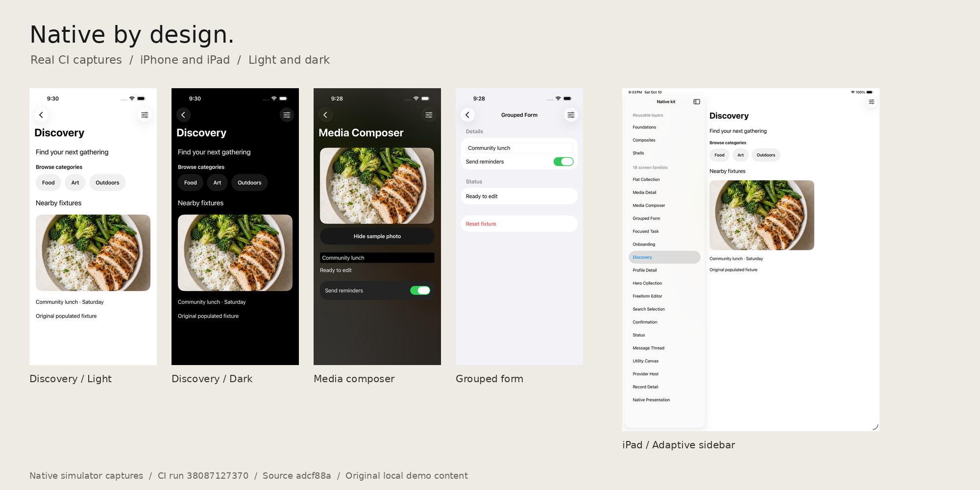
A shared visual language
Images, surfaces, type, and actions share a system. Navigation, input, focus, and presentation stay native.
Continuous image corners and genuinely concentric insets. Nested radii follow the actual padding, rather than a collection of unrelated values.
Read the corner contractAn opt-in editorial style shares palette, typography, and metrics. System, light, and dark choices stay coherent across the app’s screens and presentations.
Explore the application styleCapsule styling follows the height of real buttons, including multiline labels. Your app owns actions, disabled state, routing, and data.
Explore ownership boundariesSwift Package Manager
The layered kit is now merged into main. Pin the reviewed source below, or browse all 142 current native previews in the complete component catalog. The six overview images retain their historical adcf88a source.
Read the kit guideAlready using the core library? Keep the main quickstart.
.package(
  url: "https://github.com/jangtrinh/design-os-apple.git",
  revision: "1898ce28861d642f57dccd88fd57afcbe3be5bb9"
)

// Add this product to your app target:
.product(name: "DesignOSApple", package: "design-os-apple")
Swift 6.2 and an Apple SDK are required to compile SwiftUI. No DESIGN:OS maintainer tooling is required by consumers.
A composition system
Begin with a semantic component. Reuse a composition. Choose the shell and screen type that fit your app.
Finite geometry, media clipping, and adaptive placement.
Meaningful media, identity, labeled values, and status.
Reusable groups with caller-owned content and action slots.
One clear container, scrolling, and safe-area policy.
Named task hierarchies assembled from the same lower layers.
42 additive public APIs, plus 4 native or existing-component recipes. Historical additive counts describe the adcf88a source, not complete app flows. Inspect the machine-readable index.
This core example is kept in parity with Getting Started. It is not a demonstration of every kit layer.
import DesignOSApple
import SwiftUI

struct AccountList: View {
  var body: some View {
    List {
      DesignOSListRow {
        Label("Profile", systemImage: "person.crop.circle")
      } title: {
        Text("Account")
      } subtitle: {
        Text("Manage identity and sign-in")
      } trailing: {
        Image(systemName: "chevron.forward")
          .foregroundStyle(.secondary)
      }
    }
    .designOSProfile(.default)
  }
}Inside the kit
Six historical overview images from adcf88a. Browse the complete component catalog for 142 current native light/dark previews. Each demonstrates composition, rather than a fully reconstructed reference app.
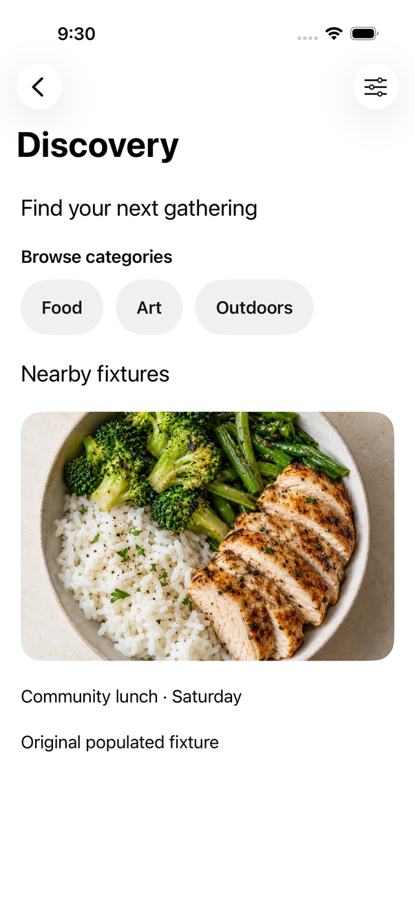
Content-led browsing, media rows, and collection hierarchy.
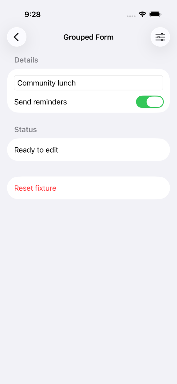
Grouped form structures with clear field and action ownership.
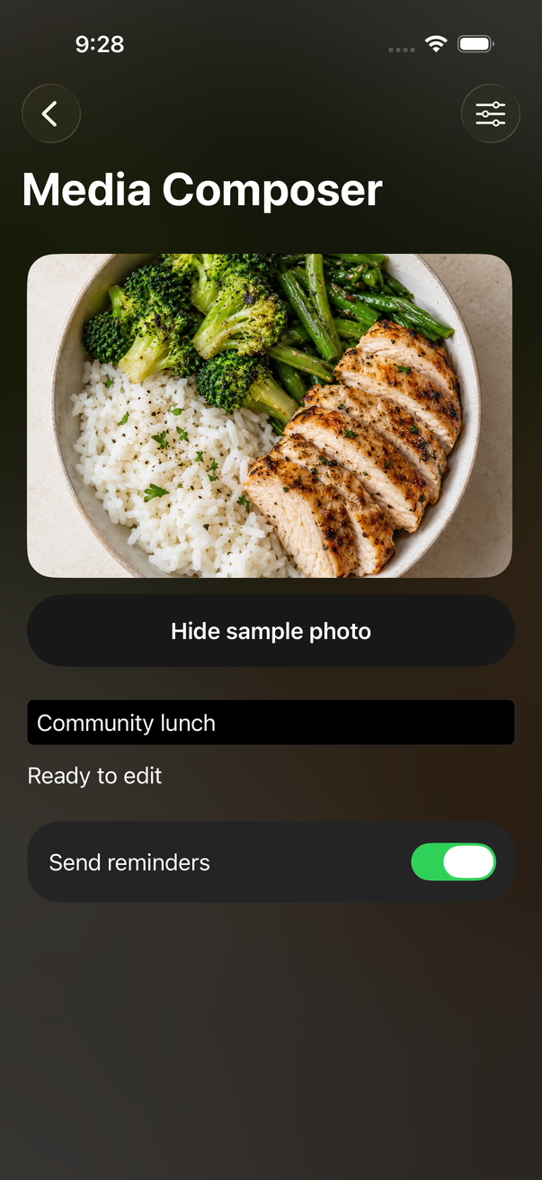
Composer and form foundations with native input behavior.
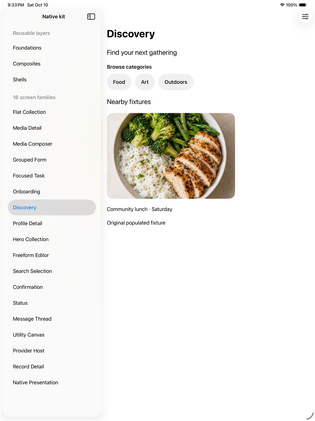
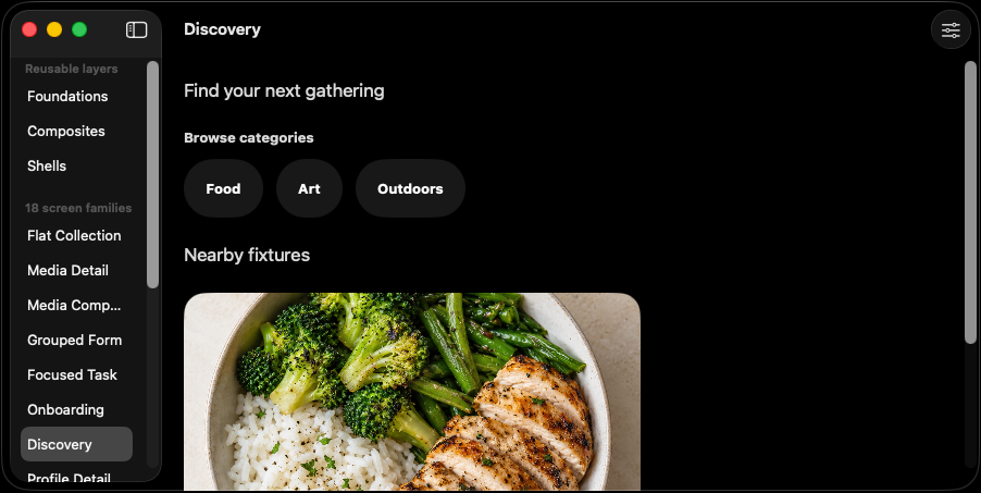
iPhone, iPad, and Mac are tested separately. A compact phone screenshot is never treated as proof of a wide-screen adaptation.
Discovery · Flat collection · Hero collection · Media detail · Record detail · Profile detail · Media composer · Freeform editor · Grouped form · Search selection · Message thread · Onboarding · Confirmation · Status · Focused task · Utility canvas · Native presentation · Provider host
Explore the screen sourceA visible proof boundary
Evidence is bound to a revision. It describes this run, not a promise that every scenario or reference state is finished.
CalorieCam 10/10 and kit 9/9 on each of iPhone, iPad, and Mac. All eight jobs passed in CI run 38087127370.
108 family captures retained from native execution. The gallery selects from those artifacts; asset provenance records source filenames and transformations.
173 reported package tests, with the genuine high-contrast fixture skipped. Portable documentation checks complement, rather than replace, Apple SDK verification.
393 reference states mapped. This is a research inventory, not 393 completely rebuilt or visually accepted screens.
Before you build
Apple Design OS is a zero-dependency SwiftUI design system for iOS, iPadOS, and macOS. Its layered kit adds reusable semantic components, composites, shells, and screen types while keeping native controls and application state in the consuming app.
The package requires Swift 6.2, iOS 17 or later, iPadOS 17 or later, and macOS 14 or later. It uses Swift Package Manager and has no external package dependencies.
Yes. The layered kit was merged into main in PR 3. The component catalog is pinned to tested revision 1898ce28861d642f57dccd88fd57afcbe3be5bb9; merged main has the same source tree. Use main or pin that revision. No version tag is claimed.
The catalog lists 99 source entries and 160 token values. It displays 142 native iPhone images across 71 visual entries, with light and dark previews. The remaining source helpers have explicit coverage notes. Selected previews do not establish complete behavior or every state on every platform.
Native CI run 38157622095 passed all 23 workflow jobs at revision 1898ce2. The reviewed capture set contains 360 isolated components, 108 screen-family fixtures and 42 dedicated text-field states across iPhone, iPad and Mac. The overview images retain their historical adcf88a provenance. Live services, physical-device behavior, complete accessibility acceptance and performance remain outside these claims.
The DESIGN:OS ecosystem
Independent tools for managing design intent, working in Figma, and publishing the work.